North Carolina State University Athletics
The Lowdown on Logos (9/15/08)
9/15/2008 12:00:00 AM | Pack Athletics
Editor's note: Dick Christy, NC State's associate athletics director for external operations, is the grandson and namesake of late Wolfpack football legend Dick Christy, who won All-America honors in 1957 and helped the Wolfpack win its first ACC football championship. Among his duties in the athletics department is oversight of GoPack.com.
When I was a kid growing up in a suburb of Philadelphia, I used to sneak into our attic and look around for memorabilia from my grandfather’s football career. The thing I looked at the most and the thing I was yelled at the most for touching was his letterman’s blanket. My understanding of the tradition was that anyone who lettered in a varsity sport used to receive this cherished memento: A red velvet blanket, trimmed in white, with a huge Block S embroidered in the center.
Like many people, that logo was my earliest connection to NC State. It will always mean something special to me and my family, just as it means a lot to anyone who has ever earned a varsity letter, worn an NC State-logoed polo shirt or bled Wolfpack red and white from the stands.
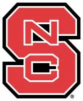
Recently, as the university unveiled the new version of that familiar logo and introduced some new licensed marks, there has been a lot of discussion about NC State moving away from the Block S. Let me assure you: We hope the Block S will always be the primary logo of NC State athletics. The history of that mark is long and well-documented. In my opinion, bringing it back in 2000 for football was a great move for NC State.
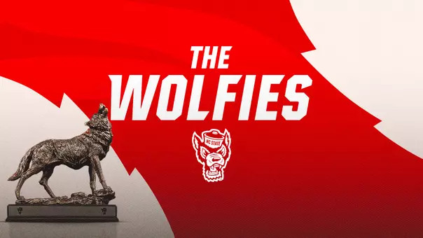
We will also continue to use a variety of logos, such as the newly introduced Three Wolves and the traditional Struttin’ Wolf that has been popular for many decades. (Click here to view all university approved logos.)
A few years ago, the university’s trademark licensing committee directed the development and redesign of our logos for officially licensed merchandise. One of the reasons we needed to do this was in large part because of quarterback Philip Rivers’ success. There was increased demand for NC State merchandise, and some version of the Block S was plastered all over the football field, televisions and retail stores across the country.
Unfortunately, it was not always the same version.
What we discovered was that the “N” and “C” were so detailed that the textile industry had trouble consistently reproducing the Block S logo on NC State apparel. This was particularly an issue on polo shirts where the logo was reduced to two or three inches. As a result, you would see a good amount of licensed apparel that had an inconsistent Block S.
To a casual fan, that’s probably no big deal. But inside the Wolfpack family, it would drive us crazy that manufacturers couldn't get it right. Not to mention the fact that our customers are paying for licensed apparel and getting products that were different from what they saw our teams wearing on the field. We had to take measures to stop that inconsistency. It was important for our future that the Block S was in a format that is easily and consistently reproduced.
So our licensing committee partnered with an agency to gather research and design proofs for updated logos. During these evaluations to streamline the Block S, the Three Wolves Logo and the Wolf silhouette were added as registered marks based on the agency’s feedback that:
- The Block S, when outside our primary market, was being confused with Stanford's S logo. In the updated Block S, you will notice the “N” and “C” are more prominent than before. Without the intricate detail of the previous logo the letters don't get lost and they jump out at you more.
- We did not have an accurate mascot representation. None of our traditional logos incorporated a pack of wolves. The agency thought having something like that would be a good peripheral mark. To me, this didn't carry as much weight because most teams are a plural form (Bulldogs, Mountaineer, Tigers) and yet their mascot or logo is singular. I guess it’s slightly more of an issue for us because our plural form, Wolfpack, doesn't just add an “s” to the end but creates a new word. A cool fact is we are actually one of few teams across all sports in the country whose mascot name does not end in “s.” (If you can count more than 15, you watch way too much “Sportscenter.”)
- The Struttin’ Wolf’s recall among younger fans was diminshed. Despite that agency feedback, we chose to keep this traditional logo, the one most easily recognized as “Tuffy the Wolf.” It was important that this logo remain a big part of our marketing, because there is way too much history to ignore. Besides, children in our market, thanks to their NC State parents, have no trouble identifying him as NC State’s mascot. Personally, I think that logo helps tie in the identity of the Block S to out-of-market fans who may have been mistaking it for something else. In reality, it's likely our efforts to push the Block S exclusively early this decade, coupled with the difficulty of reproducing the Struttin’ Wolf logo on officially licensed apparel, hurt this recall with younger fans. I am optimistic that he is making a strong comeback in our market and beyond.
Now back to today. We opted to incorporate the Three Wolves logo on the redesigned GoPack.com because it made for good symmetry with Wolfpack football coach Tom O’Brien using it as a secondary mark on this year’s football uniforms.
Obviously, we did not want to diminish our identity, which is why the Block S continues to be part of the GoPack.com masthead and is consistently used throughout the website. The new text fonts that were added also helped in that they could be attached to our newer logos to help with recognition.
The Block S is still our primary mark for practice apparel and shows up on almost every varsity sport uniform. It is the top seller in our retail outlets. And it shows up more than any other logo on the website’s new design.
More importantly it will continue to be the primary logo we use in the media and on television, which is where we create the most brand recall.
I hope this helps to shed some light on the thought processes that took place on-campus and calm any fears that we are getting rid of our traditional, most recognizable logos. We’re just offering some variety in our primary market where Wolfpack fans are most knowledgeable about our product.
We will continue to evaluate and enhance the website. Please keep giving us your feedback so we can make it a better tool for you.
Dick Christy